Gravity for the Site Design Systems
The Site team adopts Gravity design systems to create shared enterprise components for line of businesses across the company. Our mission is to provide consistent experience for customers on capitalone.com. I contributed to the Site component library and Gravity systems through designing new components, user testing them for best patterns, and documenting guidelines and specs.
Gravity Design System
When Capital One first launched its website in ‘95, the amount of expansion on the line of digital products was unimaginable. Due to its rapid growth, when designers finally stop to audit Capital One’s platforms, there were over 18 designs systems for internal and external-facing products. The Gravity designs systems was launched as an effort for a global designs systems to tie all digital products together and build brand recognition.
Site Design
Gravity for the Site is the shared design platform specifically for capitalone.com that establishes a cohesive design enabling faster time-to-market, scalability, and better results for business, users, and the brand. The Site team’s role is to adopt Gravity universal systems and create shared components and templates specific to pages on capitalone.com, which allow for:
Designers to quickly mock up pages with consistent experience
Developers to utilize existing code library of components
Content creators to understand how to cater content type & volume
Gravity for the Site Build Book
When I joined the Site team, the component library was in its very beginning stages with only a few components designed. I was brought on to the team to help lead the build book project to document our ongoing Site design systems but later ended up expanding my role to component and page designs.
Component & Guideline Documentation
One of the goals of Gravity documentation site was to host the major platform-specific design systems such as Gravity for the Site (previously called Ascend) . This documentation, or build book, would provide guidelines around the Site components and their usage for stakeholders to use as reference.
I began interviewing other designers and content creators to understand what kind of information would be helpful. In addition, I studied external design systems documentation such as Google’s Material guidelines or IBM’s Carbon guidelines to see what the industry standards are (Adele is a great resource for this).
What I found from my research was that the component documentation should include things like use cases, anatomy/breakdown of the component, and examples of visual variations. I created the first build book page of one of our most-used components, the Card Set, to be shown across the design team and content team. This later served as the template for all other component build book pages.
Confluence Documentation
I quickly found that the rate of our building components was much faster than Gravity team could go live with our build book pages. Meanwhile, there were already several stakeholders reaching out to our team to use the Site components for their webpages and we needed to provide them guidance.
We decided to host our build book MVP on Confluence which could be accessed by all our partners. Using the formatting for template pages I had set up, we were able to document component guidelines.
Stickersheets
Due to the vast amount of page types in the Capital One website, there was a need for different layouts within one component. For example, there are 4 different types of hero banners within the component itself, so that it could support different elements such as CTA or headlines. To keep the expanding components and their layouts organized, the component library was categorized into families and numerical code and communicated to partners to unify nomenclature.
Designers from partner teams got back to us, saying that it was difficult to get an understanding of all the iterations of the component by just looking at the example images in the build book. Looking over the Sketch files of components we had created, I got an idea for ‘sticker sheets’.
Ultimately, designers from other teams were able to grab any variation of a component from the sticker sheet and paste it into their designs. This also helped to pitch the vast flexibility of the Site component library to teams who were unconvinced and onboard those who were browsing our library to support their designs.
A similar version of the document noting breakpoints behaviors and specs were created for developer handoff.
Component Design
I worked with the product manager to formalize this workflow and align it to our Jira board. Once I knowledge shared the build book process to other designers on the team, it was becoming self-sufficient.
I took this chance to expand my role from design systems to component and page designs. For the most part, my hands were getting itchy for creating customer-facing designs and I wanted to test the end-to-end process component creation all the way to hand-off and documentation.
Research
Most new component needs came from migration efforts (see an example I worked on here). I recognized the need for a new component to support multiple points related to a topic, without increasing the page length or overwhelming users with text. I analyzed how similar use case was treated by external web components. A common solution was to allow for users to interact with only the content that interests them.
Iterations & Workshopping
The next step was to iterate on the component across multiple screen sizes, noting any existing patterns. For this component, it was similar to an existing accordion component for FAQs. With my recommendations, I took the component back to the team for feedback and agreement on adding this as a layout of the accordion family. Workshopping with the team, I found that this component would also be useful for other designers as they shared potential use cases for it.
Documentation
Using the workflows and templates I helped to implement, I documentation component guidelines in Confluence and created the sticker sheet for developers and designers.
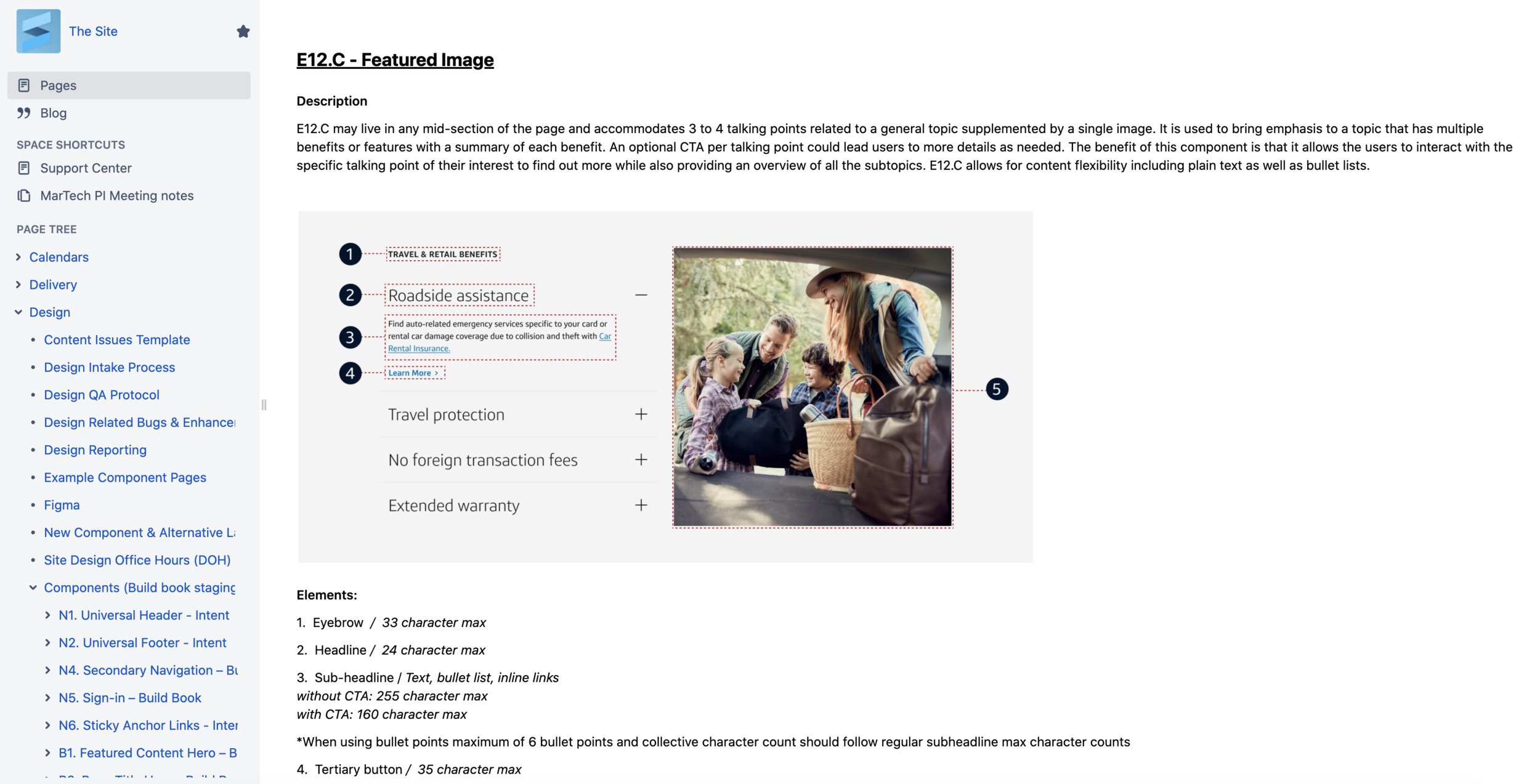
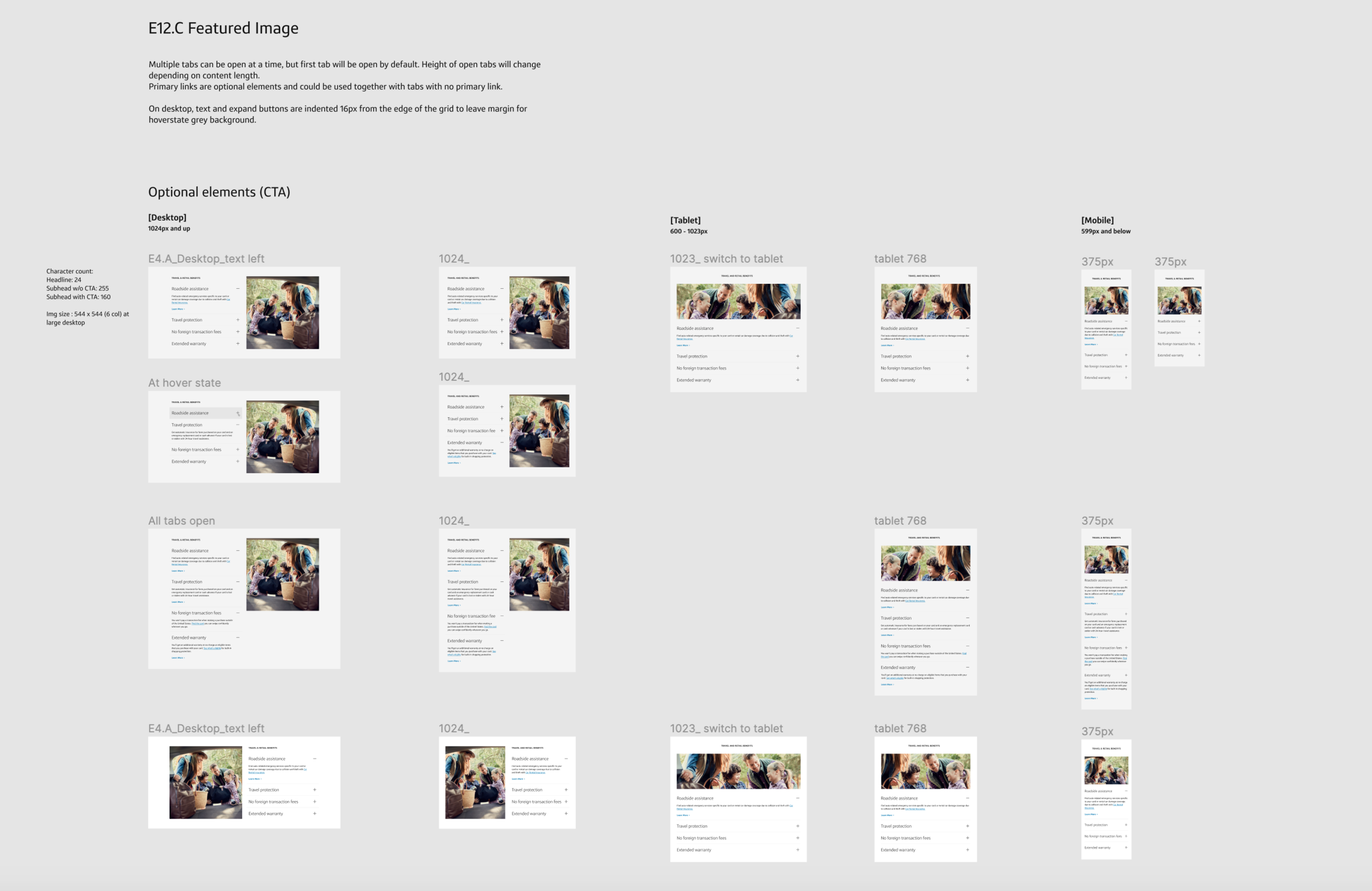
I found that content creators were also referring to the sticker sheets for more visual instances and summary of the component purpose. This was due to the Confluence guidelines being overwhelmingly text-heavy with unnecessary details like ‘visual guidelines’.
As a result, I reduced down on the guidelines in Confluence and added more images, as well as adding details like character counts in the sticker sheets since we did not have full control over which stakeholder refers to which document.
See a list of my component contribution here.
User Research
Working together with the Gravity team was essential throughout the Site component and build book project. However, like all designs, I found places where Gravity could improve for a better user experience. An example would be Gravity’s Card component, which required a directional link.
From standards in other web components, my hypothesis was that the directional link actually indicates a separate destination from the card UI component. In order to bring validity into my concerns, I conducted user research and made recommendations to remove the link.
To address the accessibility concerns over the removal of the directional CTA, I worked with the component developer to make the whole card focusable.
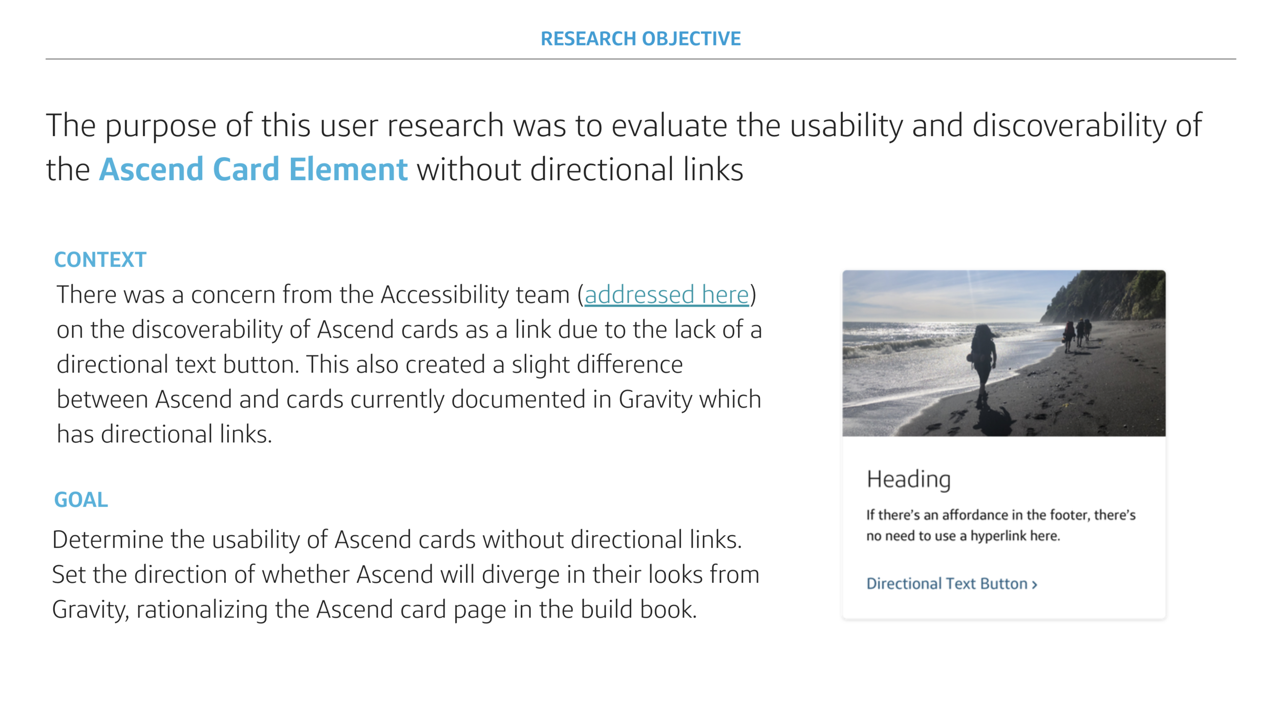
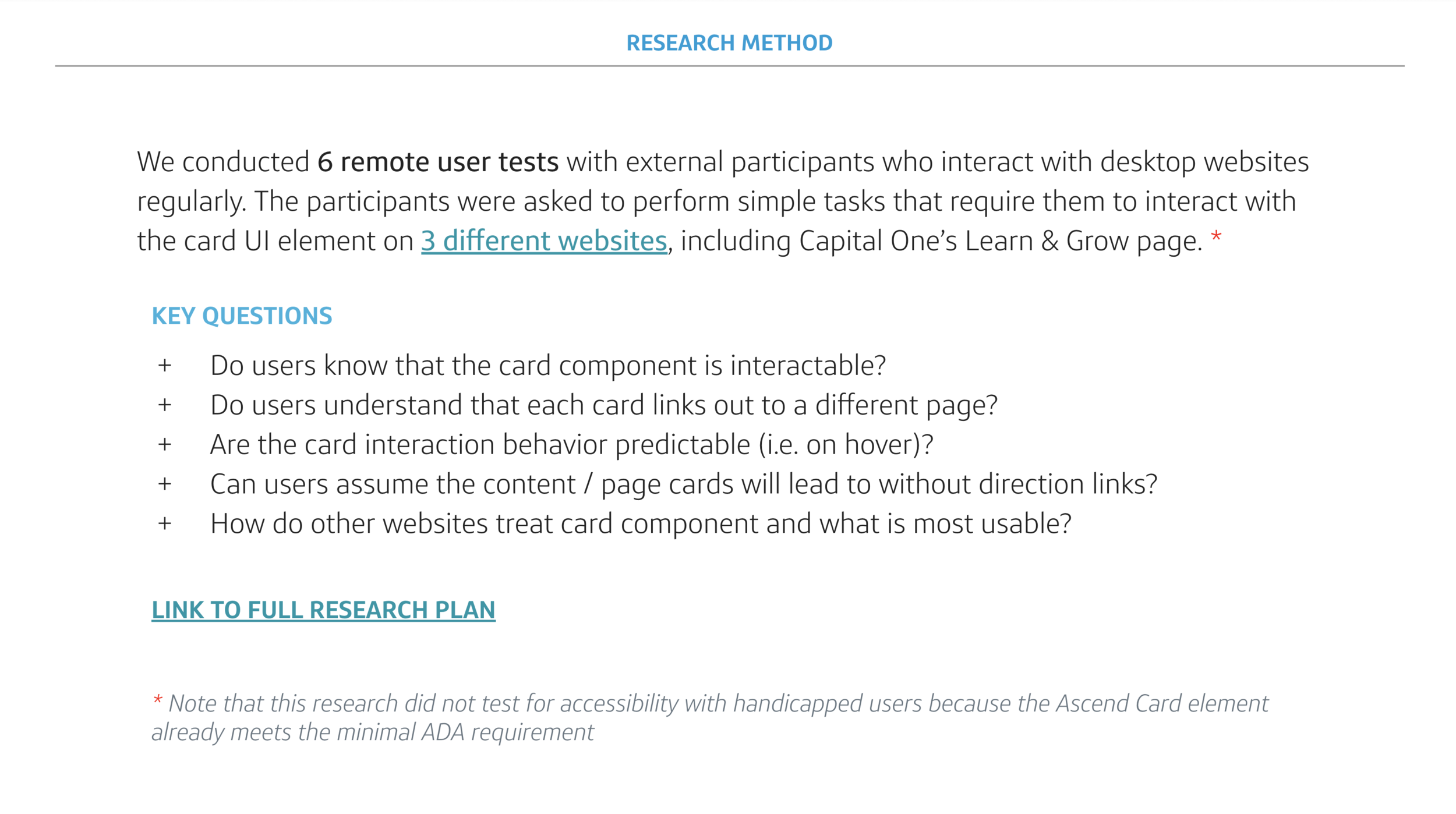
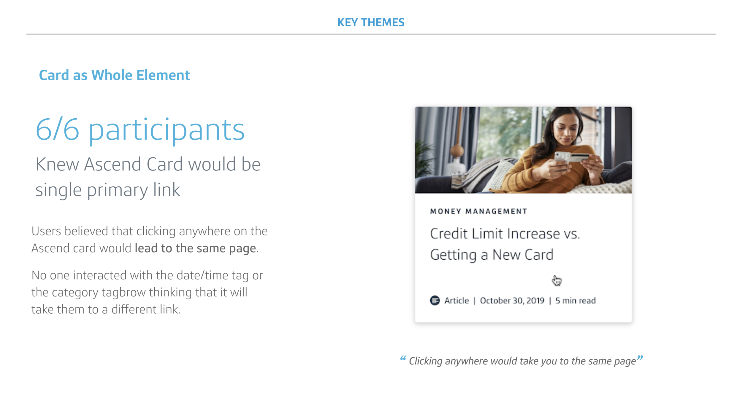
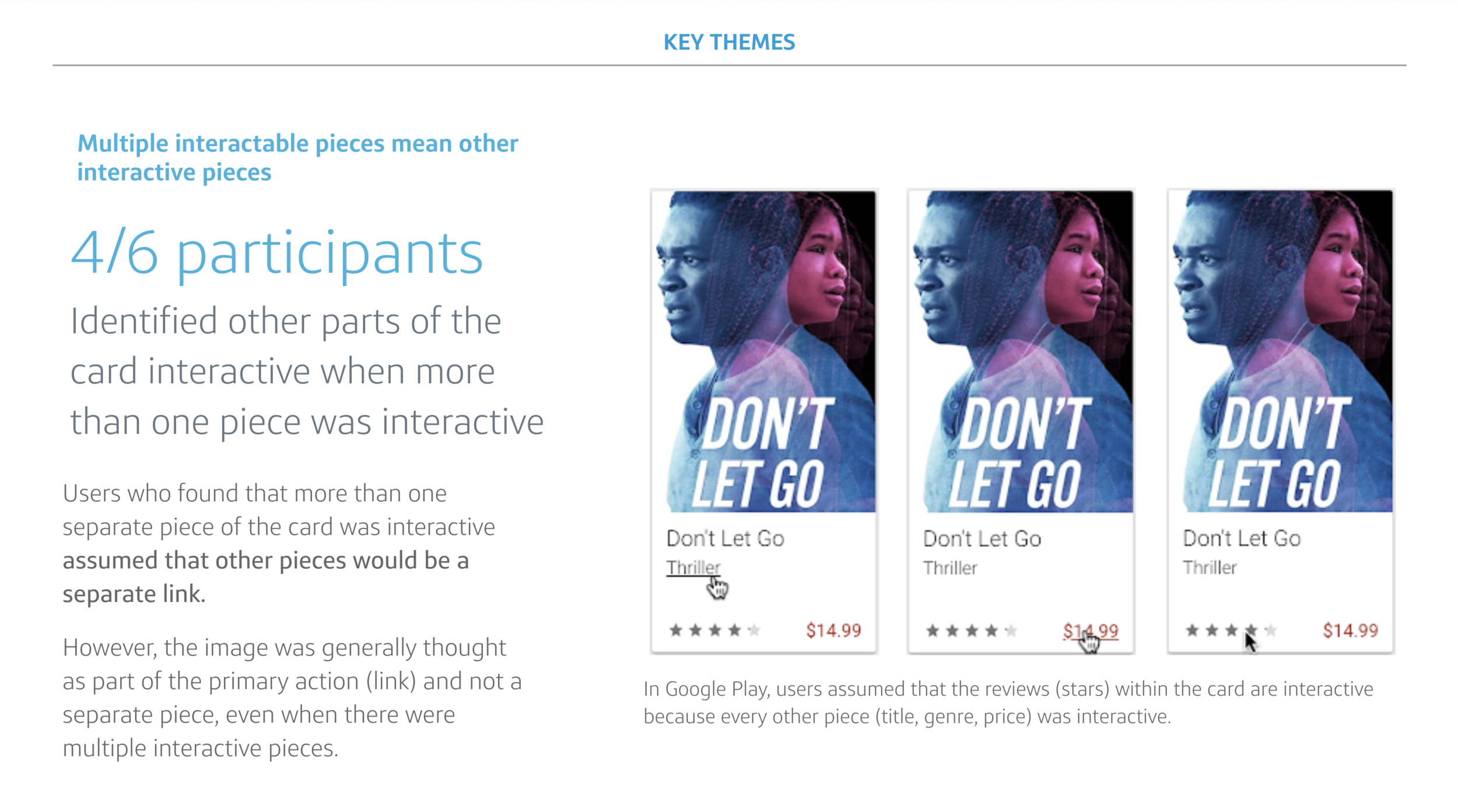
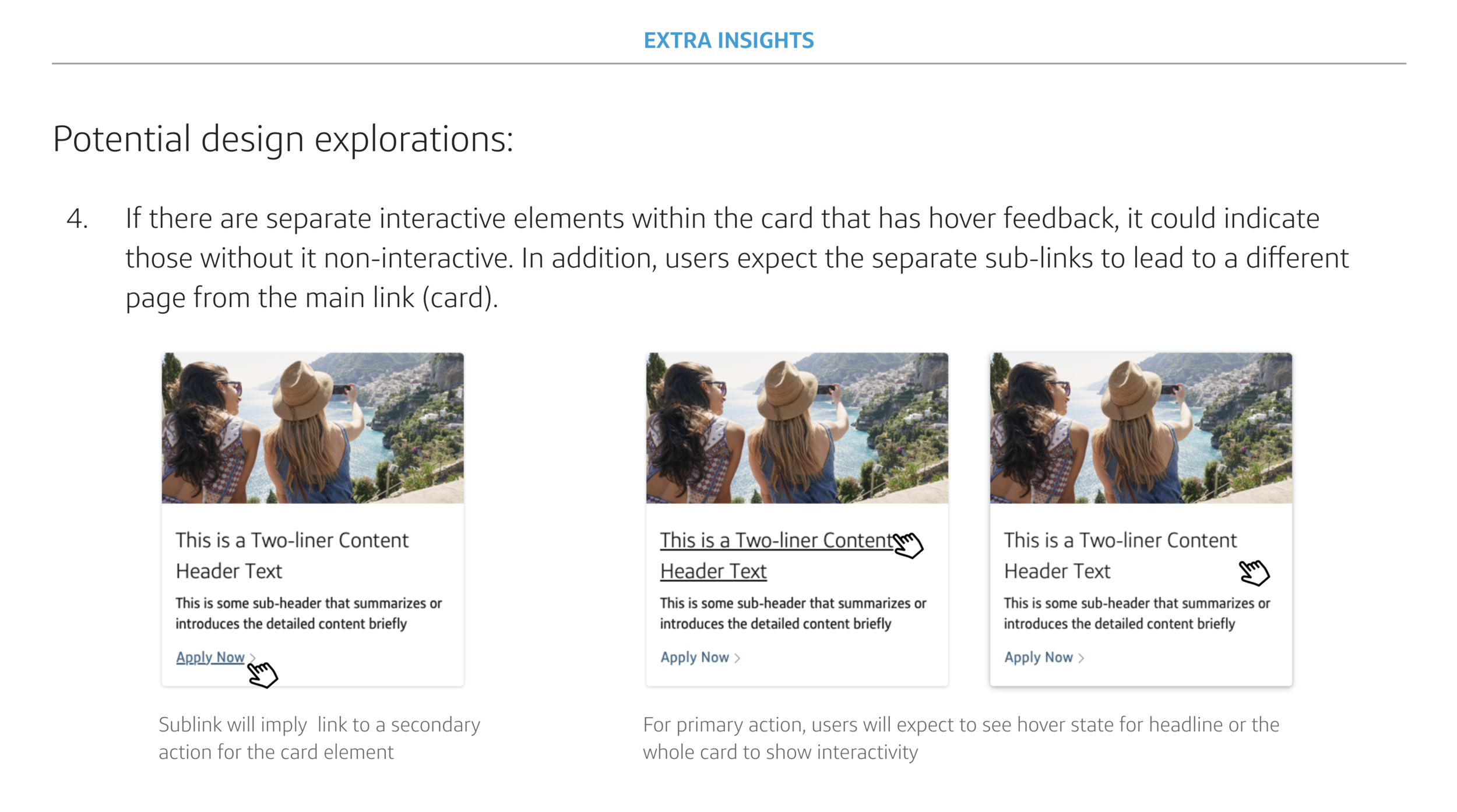
By using my research the Site team was able to influence the universal design systems guidelines and stay aligned with Gravity.
Reflection
Working on the Site design systems, I recognize the complexity of design systems language that I had not thought about when I was merely consuming the system. There were challenges across trying to align nomenclature, guideline needs, and categorization of components with 3 very different stakeholders—designers, developers, and content creators. It took many heated meetings with everyone gathered in the same room to come to a consensus.
Even still, from talking to different people, I realized that both developers and content creators had to create hacks to ‘translate’ the language designers refer to components. If migration work was not so urgent, I wish that this is something I could help improve through researching different users’ experiences.
The Site component library now help non-developers to use Enterprise components to create web pages in minutes instead of having developers take days, saving 3x the cost and time. This sets the stage for on-demand, content-only releases, allowing for rapid live testing of the best strategy for capitalone.com


