
Capital One Card Site Redesign
The Site team works with different line of businesses across Capital One to elevate customer experience on capitalone.com with consistent design language and intuitive user flow. I am in charge of researching and redesigning a set of 12 ‘out-of-flow’ pages.
The Site
The Site is a platform-specific team that inherit Brand and Gravity, Capital One’s global design systems standards. As Site designers, we create components, screen layouts, and interactive flows for digital experiences on the Capital One’s website.

Since as early as 2017, The Site team has worked to extend the design system for capitalone.com to deliver unified, aspirational, and relevant experiences while enabling faster time-to-market. As a company based division of line-of businesses, each of these sectors have heavy ownership of webpages representing their product. Therefore, a migration project not only takes design work but also logical reasoning and persuasion of multiple stakeholders.
Card Out-of-flow Pages
The Card sector serves a significant role at Capital One as the most customer-recognized service and biggest revenue driver. With the largest ratio of our account openings coming from the website, the card site pages became the first and last touchpoint before customers makes a decision.


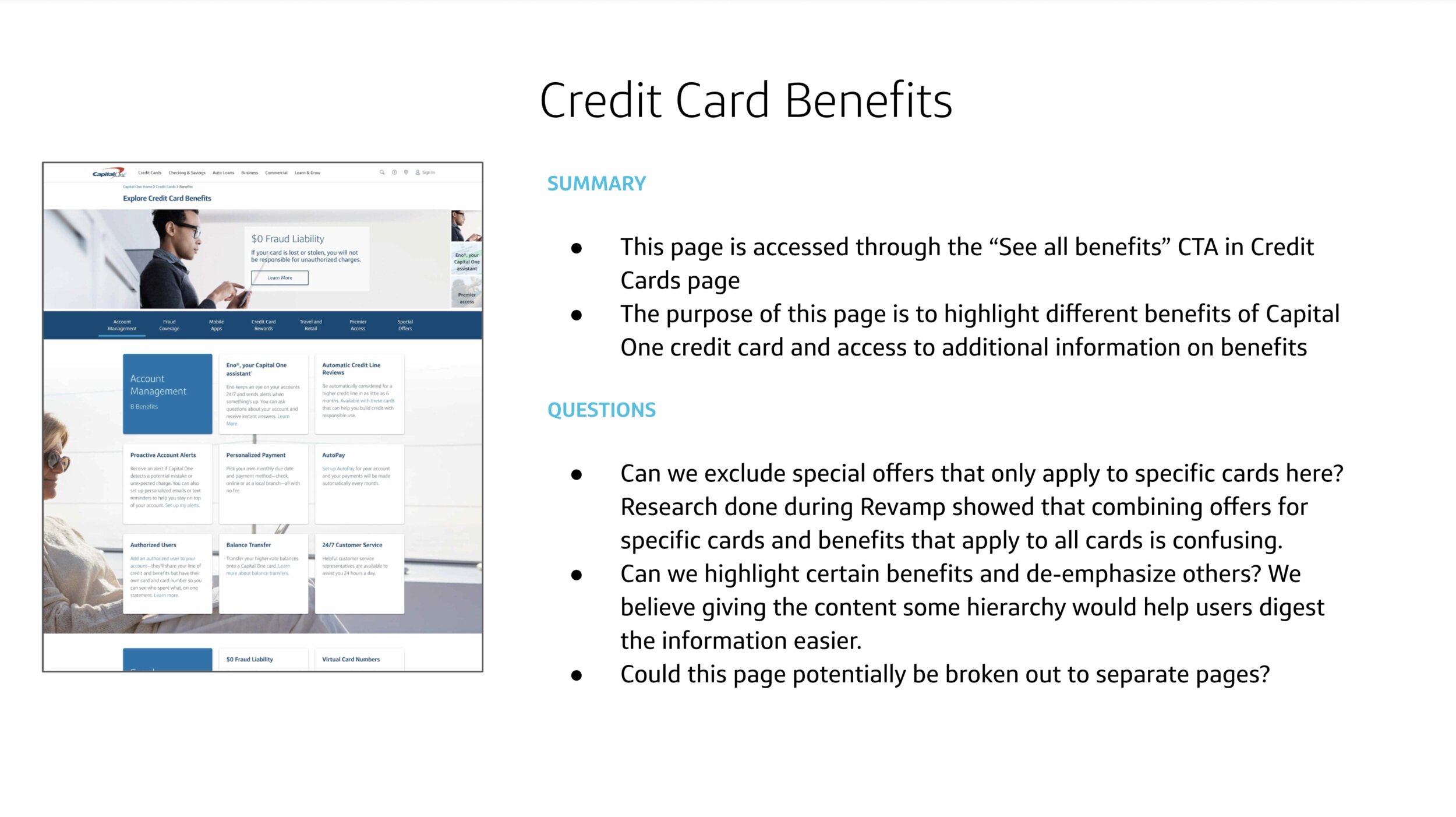
The Card team recognized that customer enter through all parts of the website, and even pages considered ‘out-of-(application)flow’ such as those highlighting the card holder benefits or FAQs generate significant amount of traffic. This initiated the partnership between Site team and Card to redesign its legacy pages using components that implement Gravity design system.
I was tasked with leading the out-of-flow pages work. This included 12 legacy pages with promotional content like card holder benefits and special card features to support pages like FAQ and card agreements which all branch off from the Card homepage.
Research
The pages were broken into 2 phases prioritized by Card products’ needs. Since I was not familiar with the card section of the site, I began by auditing the live pages to understand page goals and context, which I presented to my Card product partners.
The problems with the legacy pages were not limited to the visual inconsistencies with the current design systems. Like most legacy pages, these designs:
Lacked information hierarchy with everything on the same level instead of highlighting important information
Carried redundant information through multiple pages, and even within the same page
Had ‘island pages’ which did not have a clear path of how users could get there
Listed excessive amount of information in the fear that users will miss it
From this process, we also identified pages that could be chunked into one or retired altogether due to redundancy or outdated content that won’t be helpful to the customers.


Information Architecture
After getting clarification on page intent with partners, I mapped out the pages so that we could easily see how the information makes more sense when similar topics have been consolidated and would encourage a more logical user flow instead of overwhelming the customer by surfacing everything at once. This lack of hierarchy would actually make important information get buried.
Page Analytics
As expected, there was quite a bit of pushback from partners when suggestions about retiring pages were made. Because I also didn’t want to be killing pages if it did receive a lot of traffic, I worked with product to identify how much percentage of users coming to the site are coming to these pages and their click-through-path.
Using Adobe Analytics, I was able to confirm not much user traffic is directed to the pages, and those that did reach the page were quick to click out of it. After sharing these metrics with the Card partners, they felt more comfortable retiring some pages.
Design
Referencing the component library that my team and I had contributed to, I was able to begin organizing how the pages will be redesigned in my head. However, I wanted create better structure and user flow rather than directly porting over pages and simply improving visuals.
Wireframes
I presented different versions of the wireframed pages to Card partners to help them visualize what the suggested IA options may look like. While design wanted to break out the long pages with multiple sections into separate pages according to their topic, there was push back from Card product on keeping number of pages down.
In the end, we came to a consensus on a hybrid solution where we will drastically improve the structure of the long pages to promote hierarchy and shorten the page, which will lighten the cognitive load on users without sacrificing any essential content.


Hub Pages
Some of the problematic, long pages were ‘hub’ pages that linked to deeper level pages with more specialized information. This included the “Card Holder Benefits” and “Premier Access” pages. These pages had no hierarchy of information, surfacing every piece of detail with different wording describing the same benefits. There was also no research in what parts of the page were the most useful to the users.

Again, I set up Adobe Analytics on the live page anchor links to trace the user click flow, tracking which section of the page is most visited by users. I wanted to bring the more popular sections up to the top. For example, most customers went straight to Credit Card Rewards, so bringing that section up to the top for easier access made sense.
One of the things I was also looking out for during this exercise was when the user was quick to jump to other sections within the page, indicating that the content to deep link within that section wasn’t relevant or enough to grab their attention, which also gave me an idea of how to expand on some sections.
Lastly, I worked with our content strategist and the product owner to rework the content, chunking together information and sections.
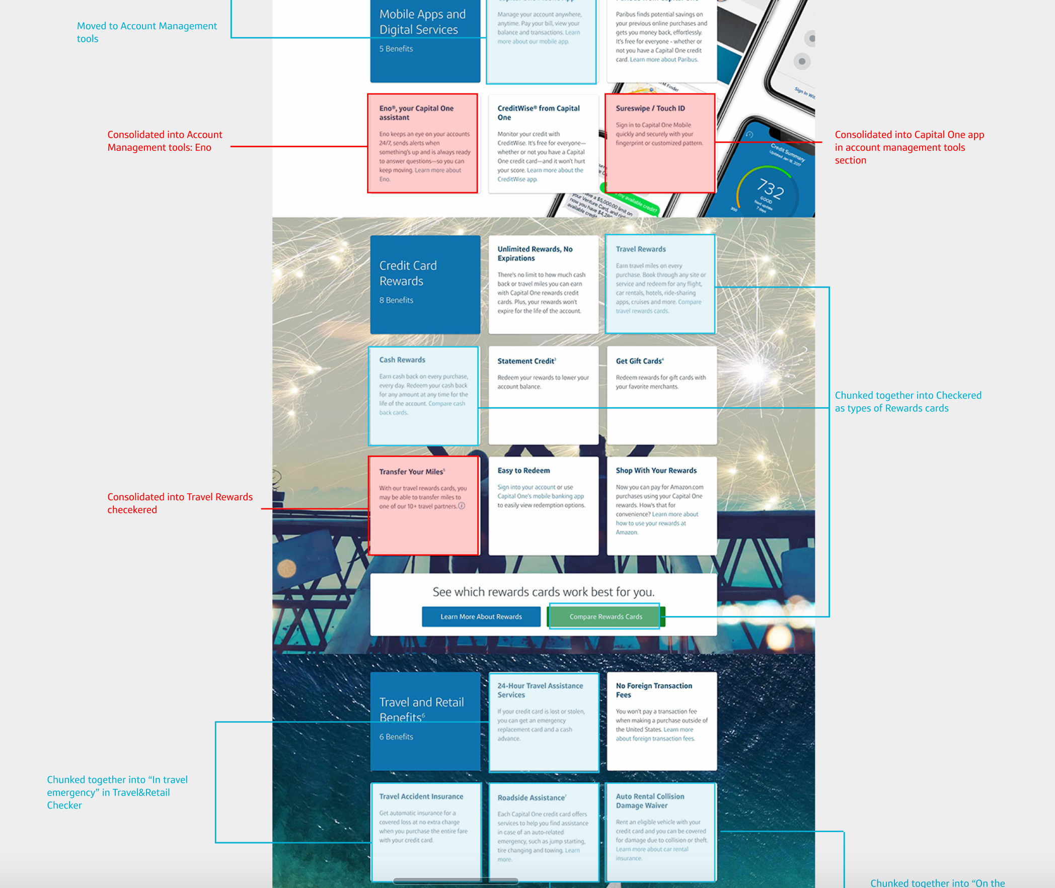

Using the wireframes from before, I built on my ‘rough idea’ replacing them with redesigned content and high fidelity components. During this process, I needed to create new components since some type of content could not be supported by existing components.
I finalized both pages after rounds of feedback from partners and other designers. For the Premier Access page, I focused on emphasizing events that are hosted by Capital One while still providing summary on all other events at a glance. I also provided a way for users to be lead back into the card application flow after they have been introduced to these card holder events.

View the full prototype of the final design by clicking on the image or here.
For the Card Holder Benefits page, I focused on decreasing the page length and streamlining the design for legibility since this is a content-heavy page. The secondary micro-interaction, such as sign in link, references to features outside of CH benefits or more universal to all credit cards, were deemphasized to bring customer’s focus to our product-special. I also wanted encourage users to engage with benefit they are interested in rather than being bombarded, so some of the information had been folded into an interactive component.

View the full prototype of the final design by clicking on the image or here.
Simple pages
The simple pages were more straightforward, as they had shorter page length and more specific content relating to the page topic. These were deeper level pages with some outstanding problems like being ‘islands’.
For these pages, I focused on reducing convoluted content so that it’s direct and easier to follow. The improvements to the visual elements along with access to the islands through the CH Benefits hub helped to tie these pages together.
Responsive Design
Designing for all the responsive web screen sizes is part of the site migration process. The problem with lack of hierarchy and long page length from the live desktop site was only worse on smaller screen sizes, as everything had to be stacked.
Using adaptive and interactive components, I was able to drastically improve the page length, especially on mobile, reducing scroll fatigue.
Reflection
Overall, I am very proud to have lead a rapid redesign effort of many pages. As my first project over the work from home era, there were difficulties in the numerous communications from one stakeholder to the next, as well during workshopping.
It was truly a project that stretched my abilities beyond design to partner relations, page metrics and content design. Given design had more leverage and time, I do wish that we could have tested the more radically simplified page design options against the final which had more restrictions pressured by partners. Many of our customers are looking for specific benefits and rewards when it comes to card application. Breaking up the hub pages to be more topic-specific could have made it easier to direct customers to the benefit they are looking for.
These page migrations are due to launch within the next year, adding to the overall Site team effort to create brand recognition and consistency. It will bring more visibility to the previously hidden deep-level pages, encouraging users to understand the benefits of Capital One credit cards.