
Capital One Commercial Card
In 2019, Capital One Commercial Card released a corporate card expense management platform for middle-market customers. In a team of 3 designers, we built out two connected platforms that act as one product to serve admins and cardholders. My responsibility as the lead designer on Mobile is to research, design, and spec out the iOS and Android app.
Travel & Expense
The Capital One Commercial Card division has offered Corporate Card program for middle market companies since its founding days. When I joined the team in 2018, the corporate expense management platform was an incubator product to be launched as a beta product.
My focus was on the reconciliation of travel and expenses made with employee corporate cards. Based off research and simple interviews, we found that every company has a standard procedure for expensing:
T&E Administrator (Admin) provides an employee with a company card
Employee spends money on the card for travel or other services
Employee is required to provide information and documentation such as receipts and reasoning for the expense
T&E Admin or Manager reviews and approves/declines the expense or report
T&E Admin reconciles all expenses at the end of the billing cycle
T&E Admin reports company financials up to higher levels such as CFO or CEO

Defining Personas
Within this model, the team had defined company segments during the early states of product discovery which directed our strategy on how we could address each segment’s ecosystems in which our users work. I was able to work off of these two segments of companies: Simple company and complex company.


Admins
There are usually two sides of reconciliation—employees who submit their expenses and approvers who review the expense reports. In smaller companies, the admin role could be given to senior accounting managers, CFOs, or even CEOs, who wear many hats. Their tasks could range from managing vendor payments and invoices to tracking down expense requirements from cardholders.
In bigger companies where there are more levels or hierarchy, the admin role would be more dispersed across multiple people, where each person would have a more focused tasks.
Regardless of the company size, both admin roles had the common pain point of spending hours per week reviewing expense reports, chasing down cardholders for required documents like receipts, fixing expense coding errors, and reconciliation at the end of month.


Cardholders
Employees with corporate cards were similar across companies. Most of their pain points came from the inconvenience of filling out expense reports.
Through interviews we found that card holders:
Have lost receipts, having to go through additional paper work to prove their expense
Have been pinged by their admin/approver for forgetting to attach documentation
Keeps physical copies of receipts for reassurance until reimbursed, creating clutter
Have forgotten to do/submit their expense reports, resulting in minor penalties
Would save all expense reporting tasks like attaching receipts until end of month
Are not entirely familiar with the exact T&E policy due to unclear communication
Overall, doing expense reports was a tedious task they didn’t want to spend time on, and would be the last thing on their todo list.

Defining the Story
Needs & Wants
We wanted to focus on how we could improve the experience for admin and cardholders during their biggest pain points that our competitors like Concur and Expensify could not fully resolve. We performed a keyword exercise to get an understanding of what the users would want from a product that deals with their expenses and funds.


In addition, we mapped out how we could address user needs from a business standpoint. It became obvious that we needed to make the cardholder’s experience as seamless and intuitive as possible so they could quickly accomplish their expensing tasks, while creating a solution for admins to check policy adherence and code expenses accurately.

The User Journey
At this point, we heard stories from both admins and cardholders on their tasks, but did not see how their individual processes fit together. Despite my focus on card holders, I wanted to use our research findings to create a journey map for the 3 personas. This exercise helped to see their journey chronologically, where their interaction points are, and how the process could be broken down into parts.
We identified our areas of opportunity for how our product could assist users to complete their tasks. Through this, emerged a clear idea of shippable product features.

User journey map to visualize our customers’ experience through the expensing process. Click the image to see the whole map.

Workshopping
Collaborations with Tech & Product
If the vision for our product was the innovative future state in the journey map, we now needed to be grounded in reality. Together with our product and tech partners, we lead workshops to align our vision on product features.
It was refreshing to see them go through the usual design exercises like “How might we…”, and gain their insight on achievable features. We hashed out uncertainties concerning the tech effort required for design’s solutions, and how to best implement them in sprints.


OMNI Design Systems
Alongside designing for the experience, we were still in the works of developing a design system, especially within the mobile platform. Using the foundations from the OMNI web components, I contributed to building out the mobile design system and patterns, often user testing the components to justify why web patterns should not be directly translated to mobile.

Components
While building out the component library both iOS and Android’s native UI elements were considered to comply with their mobile standards. This final component library was shared up to the universal OMNI library.


Patterns
We stayed consistent with the visual and functional aspect of OMNI web for the mobile design systems. However, some patterns had to be optimized for for a more mobile-friendly experience, which I brought back together to the larger web team for discussions.

T&Easy App | Core Features
We focused on a mobile-first approach for cardholders, as it allowed for an on-the-go solution to capturing expense data. As the main designer on the T&Easy mobile app, I worked with Android and iOS developers to deliver UX / UI flows.
Expense Report
Cardholders are able to create and submit their expense reports from their phone. The app automatically categorizes and checks for expenses that need more information, minimizing expense report errors that cause them to be sent back.
Mileage
When employees need to be reimbursed for their mileage related to work travel, they could simply enter in their start and end location to get their amount estimate to be submitted.
Card Lock
Cardholders can lock and unlock their cards from the app to stop charges instantly, in case their corporate cards are lost or stolen. Admins could also place locks on cards for any suspicious activity or policy abuse.
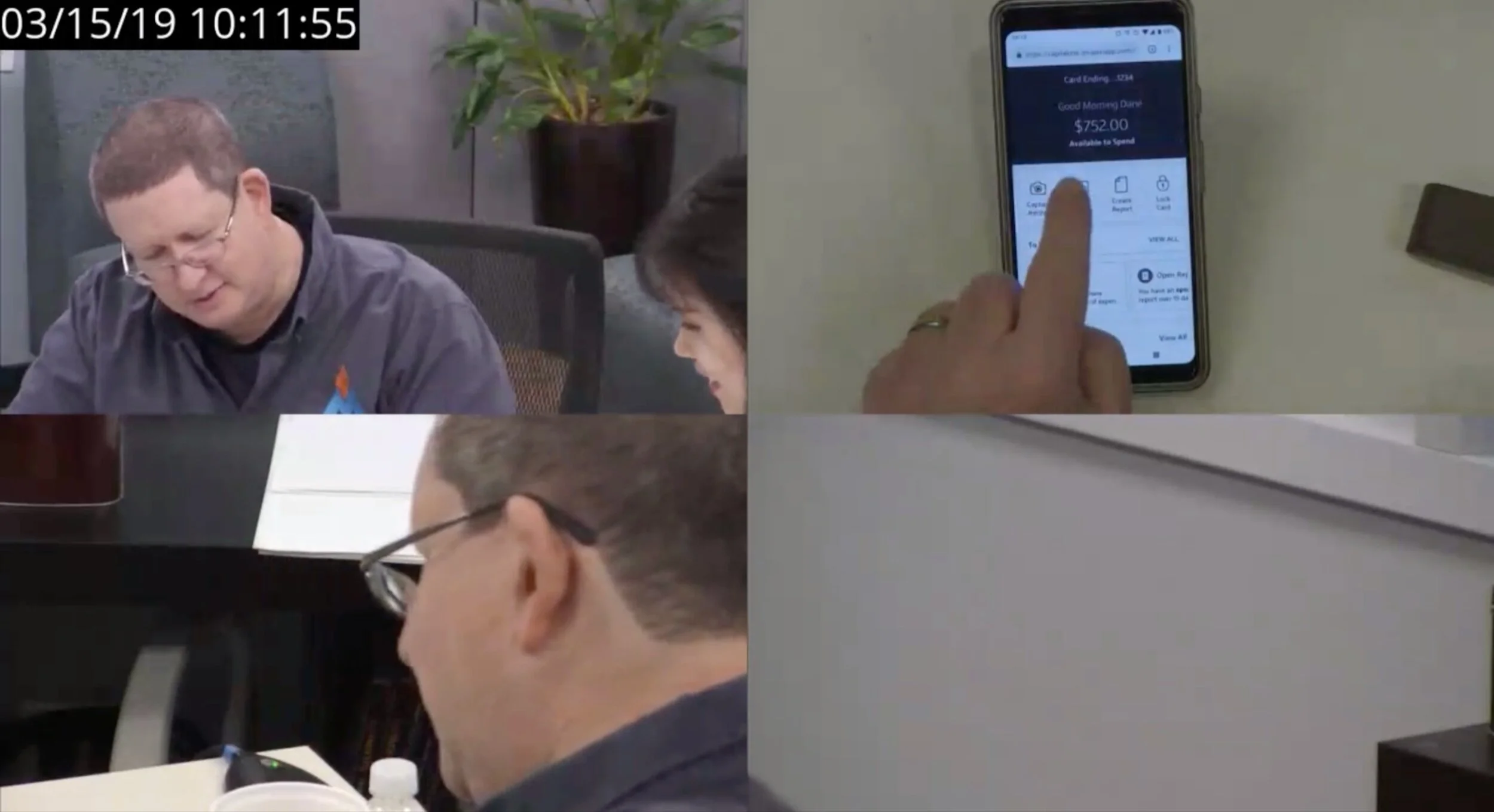
Receipt Capture & Expense Detail
Cardholders can document pictures of receipts on-the-go along with any required information for each transaction, which the app would flag automatically depending on company policy, to be submitted for reimbursement.
Research
Using both in-lab user sessions and remote testing, my team and I were able to prototype and test different concepts for core features.
Most participants found the app very helpful compared to their current process, or the lack-there-of. For those who use our competitor products, the modern and intuitive interface especially stood out. We even had people who wanted to show the prototype to their admin!
"An app like this would be beneficial across companies... it would encourage employees to get their expenses submitted on time and make it less confusing and disastrous for the company overall"

T&Easy App | Subsidiary Flows
As outlined in the journey map, there were additional need for ‘outside-of-main-flow’ designs that users needed for various setup, support and account-related tasks. Working with product, I lead the effort to create flows to satisfy company and cardholder needs for enhanced security and in-app user assistance.
This effort reduced the support calls to Capital One customer service, which is one of the costliest forms of support. Most importantly, it minimized the dependency on admins for troubleshooting minimal account and registration tasks, allowing admins to focus on their jobs while empowering card holders.
T&Easy App | Messaging
Research
From our ideation sessions, we concluded that using app notifications would not only nudge card holders at appropriate times, but also help increase user engagement with T&Easy outside of the app.
The product owner and I set up 9 hour-long interviews to understand user behavior around expense reporting and their interaction with software notifications.
Recommendation
Based on the research findings, I presented a set of recommendations around actionable notifications which will later feed into T&Easy’s overall messaging strategy.
Having customized push notifications would allow users to get reminded when they want, like when their transaction requires so they could capture the photo on the spot. Card holders would not need to set up hacks for due dates if they got notifications through the app, which they could instantly act upon.
Admin Portal
Research
As we T&Easy MVP was being launched for beta, we began discussing how different company policy would change the parameters implemented in the app, like the receipt requirement. After all, the app was part of a unified platform experience for two sides of a task.
I shifted my focus from card holders to admins, who usually put these policies in place. Again, the product owner and I lead interviews to gain deep understanding of admin workflow for feature-level insights.


Recommendation
After interviewing several admins, it was clear that there was no one-size-fits-all solution. The way corporate card programs were crafted varied from IRS standards to company-specifics.
For both card holders and admins, the option for customization seemed essential. Using the findings from research, I presented an approach for onboarding where admins could choose out-of-the-box policy recommended by Capital One or set their own requirements.
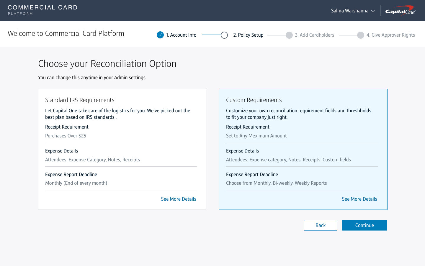
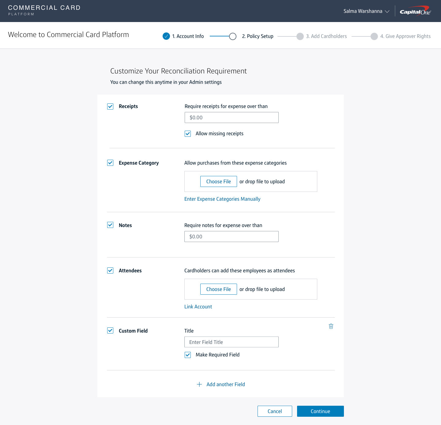
This strategy later contributed to the Commercial Card Platform T&E for administrators that enable our customers to manage their card and expense program. Through this platform admins have access to card and policy management, real-time spend controls, and card holder expense reports.
Reflection
After the beta launch of the expense management platform, I left the team having accomplished more than I thought I could have in a year. I am proud to have served an important role in the foundation of a new Capital One digital experience.
There were quite a few roadblocks along the way, as design often had to push back on Sales to provide a service that would actually serve our customers’ needs instead of taking shortcuts to go into production. Involving our sales and product partners in the beta testing and research process with real customers, we were able to influence the business’s purchase volume-driven measure of success to be more user-centered.
I had a big learning curve when I initially joined the project as I had to catch up to the research done during the early stages of the product. However, I grew so much as a designer, working in a close-knit group of product owners and developers— participating in the scrum rituals and working through ambiguities of our problem space. Addressing the needs of both sides of expensing while making the transition of tasks between them smooth was a complex story that required the ability to see the entire experience, which I embed in all my designs.